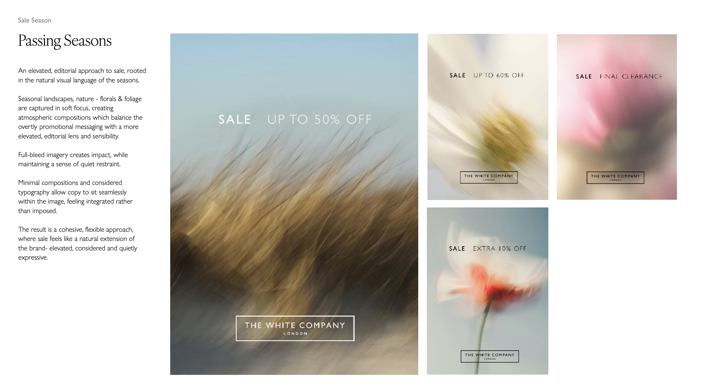
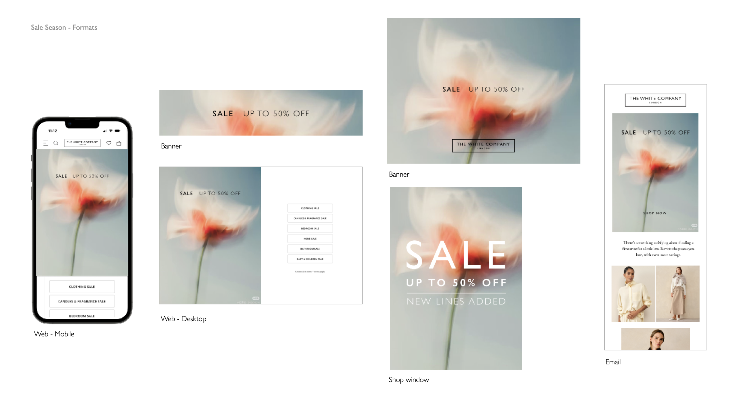
The approach was about restraint. Instead of defaulting to red banners and shouty typography, we created a system that kept the brand's tone of voice intact while making the commercial message clear - considered colour choices & consistent typographic hierarchy. The result was a sale identity that felt like a natural extension of the brand rather than a departure from it.