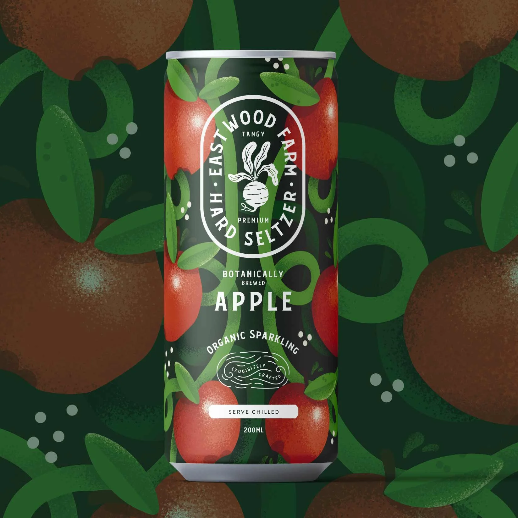
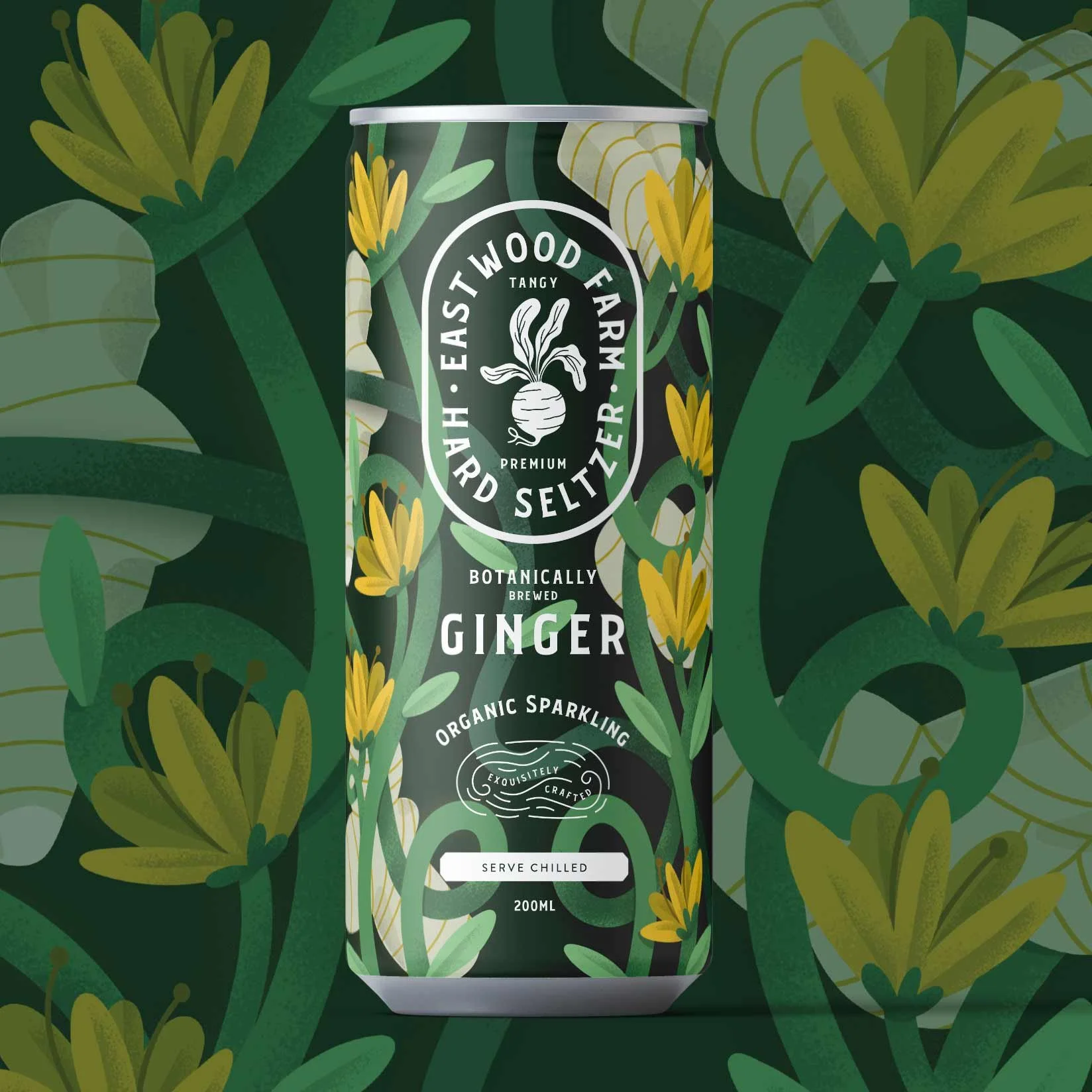
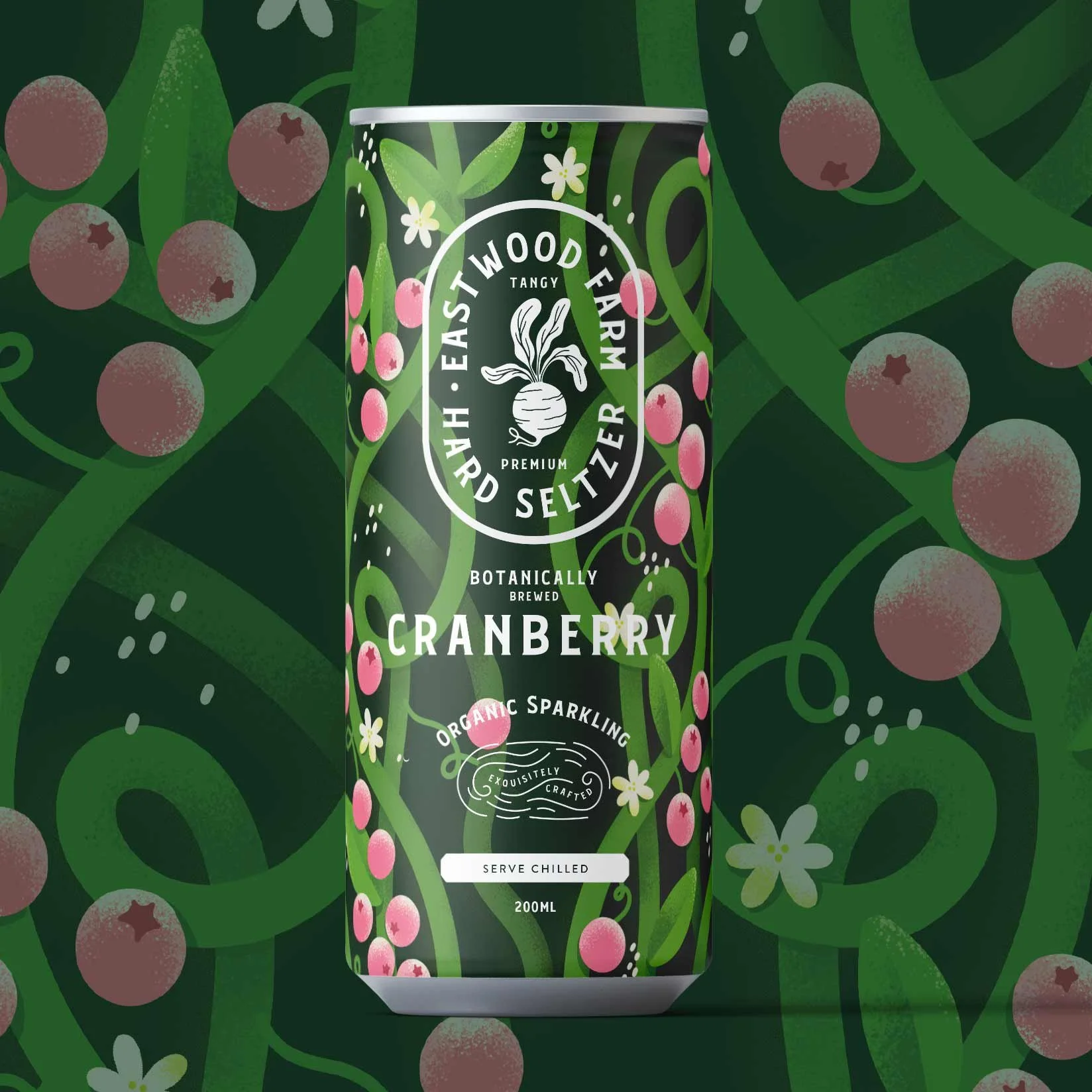
Disciplines: Packaging Design, Brand Identity, Colour Strategy, Illustration
Packaging concept for Eastwood Farm - a drinks range where each flavour needed its own identity while still reading as one family on the shelf. The challenge with multi-variant packaging is getting the balance right between differentiation and cohesion: too similar and customers can't tell them apart at a glance, too different and it stops looking like a range. I used colour as the primary differentiator, assigning each variant a distinct palette while keeping the layout, typography, and illustration style consistent across the set. The result is a range that feels unified but easy to navigate.